Why Your Website Isn’t Converting Ad Traffic: A 12-Point Landing Page Teardown
When ads get clicks but not enquiries, the landing page is usually where the money leaks. Here is the 12-point teardown I run on every page before I spend more on traffic.
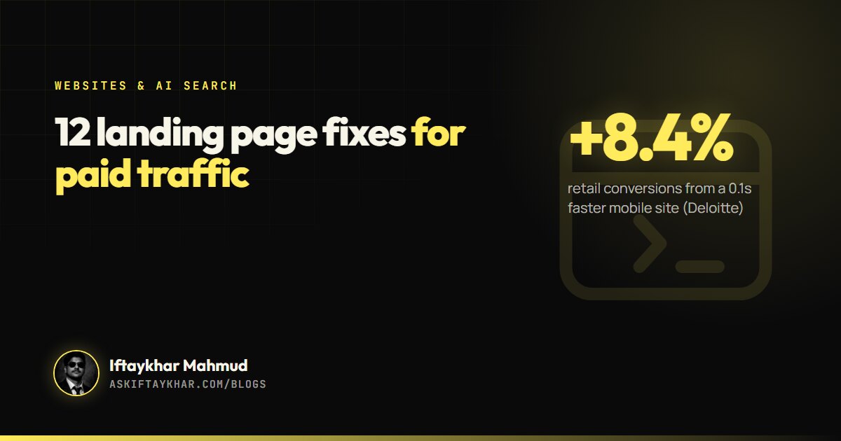
Landing page conversion improves when the page continues the exact promise of the ad, loads fast, shows proof near the call to action and makes the next step effortless on a phone. Deloitte found a 0.1-second faster mobile site lifted retail conversions by 8.4%, so speed and clarity are both worth money.
Key takeaways
Match the headline to the ad and the search, word for word where you can.
A 0.1-second improvement in mobile site speed lifted retail conversions by 8.4% in a Deloitte study.
Google's Core Web Vitals targets are LCP within 2.5 seconds, INP under 200 milliseconds and CLS below 0.1.
One goal per page, proof next to the button, and a form with only the fields you truly need.
A good ad makes a promise. The landing page has a few seconds to prove the promise was real. When ads get clicks but the enquiries do not follow, owners usually blame the ads, change the targeting, and pay for more clicks that land on the same page.
Very often, the leak is not the ad. It is the page. Landing page conversion is where paid traffic either becomes revenue or quietly disappears, and fixing it is usually cheaper than buying more traffic.
This is the 12-point teardown I run on every page before recommending more ad spend.
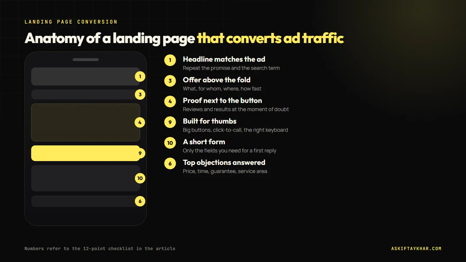
Where the key checklist items sit on a mobile landing page.
Message and offer
1. The headline matches the ad
If the ad says “Same-day iPhone screen repair in Parramatta”, the page should say that, not “Welcome to our store”. Message match reassures the visitor that they landed in the right place. For search campaigns, I often create one page per service so the headline can repeat the keyword the person searched.
2. One page, one goal
A landing page for ads should ask for one thing: a call, a booking, a quote request, a purchase. Navigation menus, newsletter pop-ups and links to the blog all compete with that goal. Keep them off the page or push them far down.
3. The offer is visible without scrolling
On a phone, the first screen should show what you do, for whom, where, and the main action. Price or “from” pricing, turnaround time and a guarantee belong here when you have them.
Trust and proof
4. Proof sits next to the call to action
Reviews, star ratings, before and after photos, client logos and short testimonials work hardest when they sit right beside the button, not on a separate page. The moment of doubt happens just before the click.
5. Local and specific details
For local businesses: the suburb, the service area, the address, opening hours and a real phone number. Specific details are more believable than general claims.
6. Answers to the top objections
Every service has three or four questions that stop people from enquiring: how much, how long, is it guaranteed, do you come to me. Answer them on the page, briefly. A short FAQ section works well.
Speed and experience
7. The page loads fast on mobile
Speed is not a technical nicety. Deloitte and Google studied 37 brands and found that a 0.1-second improvement in mobile site speed increased retail conversions by 8.4% and travel conversions by 10.1%, with retail average order value up 9.2%.
+10.1%travel conversions from the same improvementSource: Deloitte
8. Core Web Vitals pass
Google’s Core Web Vitals turn “fast” into measurable targets. A page has good Largest Contentful Paint when the main content loads within 2.5 seconds, good Interaction to Next Paint when it responds to taps within 200 milliseconds, and good Cumulative Layout Shift when things do not jump around, with a score below 0.1.
Google's Core Web Vitals targets for a good experience, from web.dev.
I check these in PageSpeed Insights for the exact page the ads point to, on mobile. Large hero images, heavy sliders, chat widgets and too many tracking scripts are the usual causes of a failing score.
9. The layout is built for thumbs
Buttons large enough to tap, a click-to-call link on the phone number, forms that open the right keyboard for email and phone fields, and no tiny text. Most paid social traffic arrives on a phone, so the mobile version is the real version.
Landing page conversion mechanics
10. The form asks only what you need
Every extra field costs completions. For a first enquiry, name, phone or email, and one question about the job is usually enough. Ask the rest on the call.
11. Tracking works end to end
The form submission, the call click and the booking should each fire a conversion that reaches your ad platforms, and the page should capture the ad click ID for lead-based businesses. Without this, you cannot tell which ads produce customers. See the Google Ads conversion tracking checklist and the Meta Conversions API guide.
12. The thank-you step keeps momentum
After the form, show what happens next and when, offer a booking slot if possible, and send an instant confirmation. A fast, personal follow-up is where many leads are won or lost, as I explain in the speed to lead guide.
How to test changes without fooling yourself
Once the obvious leaks are fixed, improvements come from testing. A few rules keep the results honest.
Change one big thing at a time. A new headline and a new form and a new hero image at once will tell you the page improved, but not why.
Wait for enough enquiries. Ten leads is not a verdict. On a small budget, compare full weeks, and give each version a fair share of traffic.
Compare like with like. A version tested during a holiday week or a sale is not comparable with a normal week.
Judge on enquiries that became customers. A change that doubles form fills but brings in tyre-kickers is not a win. Tie the test back to booked jobs or sales where you can.
Ad platforms and most website tools can split traffic between two versions of a page, but even a simple before-and-after comparison works if you are disciplined about timing.
A real example: a conversion-first service website
For Asorin Management Inc., a mobile car key, fob and remote replacement business in the Greater Toronto Area, the starting point was no conversion-first website at all. I built a site covering every key, fob and remote service, published the service area as 20 named suburbs with structured data, and routed scattered phone, email and message enquiries into one booked, trackable pipeline.
That is most of this checklist applied to one business: specific service pages, local proof, a clear service area and an enquiry flow that does not lose people.
How I run a landing page teardown
Open the ad and the landing page side by side on a phone.
Read only the first screen. Is the promise the same?
Run PageSpeed Insights on the exact URL, on mobile.
Submit the form and time the confirmation and the follow-up.
Check that the conversion reached the ad platform.
List fixes by expected impact and effort, and do the top three first.
Should you use a separate landing page or your website?
For most small businesses, a well-built service page on the main website works as the landing page, and it builds search visibility at the same time. Dedicated landing pages make sense for specific campaigns, offers or audiences that need a different message. Either way, the 12 points above apply.
It depends heavily on the industry, the offer and the traffic source, so a single benchmark is misleading. Measure your own baseline, change one major element at a time and compare against that baseline rather than against a generic average.
How fast should a landing page load?
Aim for Google's Core Web Vitals targets on mobile: main content visible within 2.5 seconds, responses to taps within 200 milliseconds and a layout shift score below 0.1. Faster is better: Deloitte found even 0.1 seconds made a measurable difference to conversions.
What is message match on a landing page?
Message match means the landing page repeats the promise, wording and offer of the ad or search that brought the visitor. It tells people immediately that they are in the right place.
How many fields should a lead form have?
As few as you need to follow up properly. For most service businesses, name, a phone number or email, and one question about the job is enough for a first enquiry.
Do I need a separate landing page for Google Ads?
Not always. A focused service page on your main site can work well and supports SEO too. Use a separate landing page when a campaign needs a different message or offer from your normal pages.
More people now get answers from AI before they ever see a list of links. Here is what makes an AI assistant cite one business over another, and the exact steps I took on this website.
 Iftaykhar MahmudGrowth marketer, Dhaka